EDITORIAL HIERARCHYEditorial hierarchy
Newspaper-like headlines, columns and white space organise extensive menu and brand information into a clear reading order.
 KORE DESIGNArchitecture · Interior · Delivery
GRAPHIC SYSTEM / MENU & WAYFINDING
Menu content, brand story and location information are organised through editorial design, then scaled into a one-by-two-metre wayfinding poster for the shopping-centre environment.
From reading in the hand
to recognition at a distance.
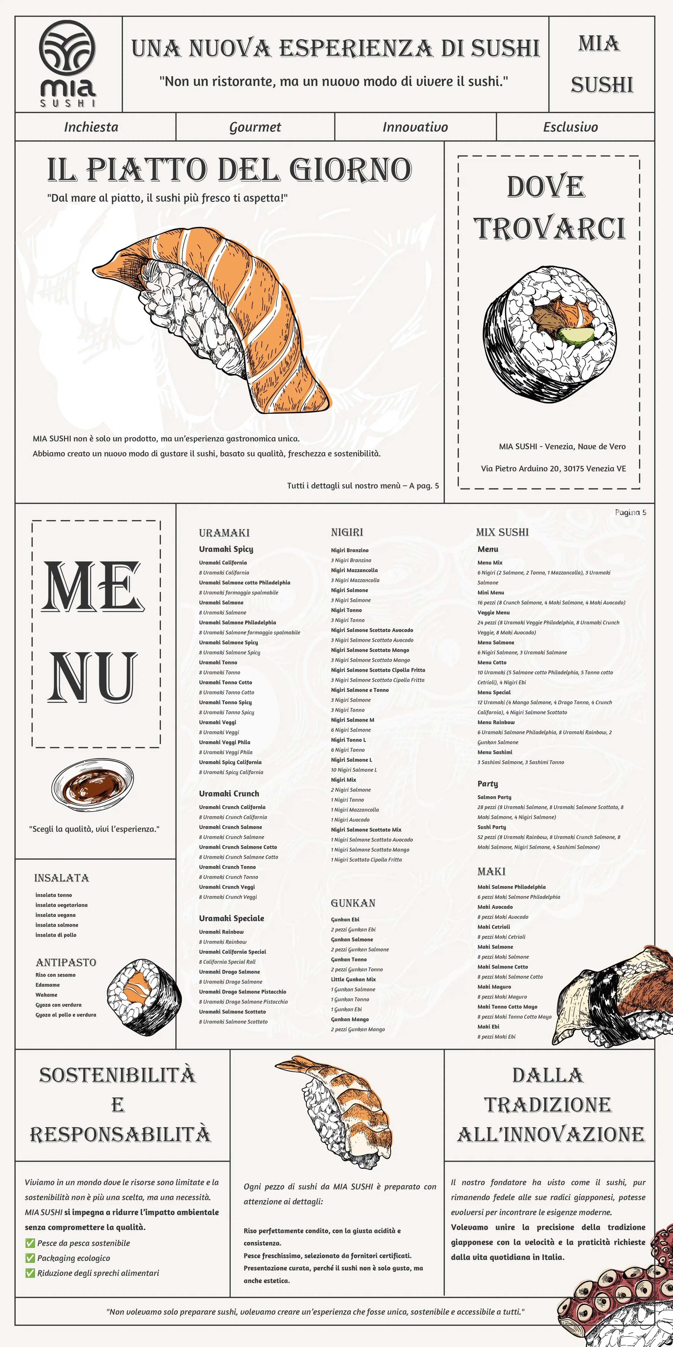
The menu must carry rich content while wayfinding must be read quickly in motion. KORE uses headline hierarchy, orange and black fields, sushi illustrations and a grid so both scales share one brand voice.
Newspaper-like headlines, columns and white space organise extensive menu and brand information into a clear reading order.
Sushi illustrations, orange-and-black colour and high-contrast headlines create a brand memory that can extend.
One language scales from a handheld menu to mall wayfinding, with density recomposed for viewing distance.
Work is presented within one editorial frame. The vertical poster retains its natural ratio and the mall visual is shown at an appropriate scale.
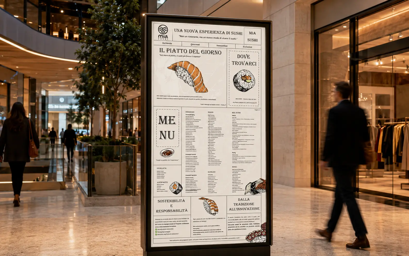
Columns, headlines, illustrations and colour rules extend across menus, events and mall directions while retaining one reading rhythm.
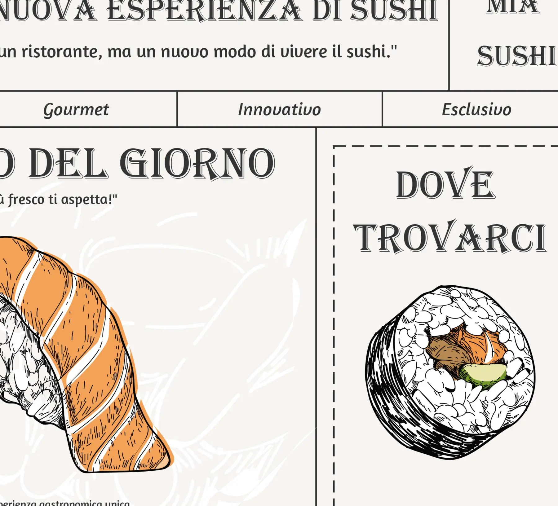
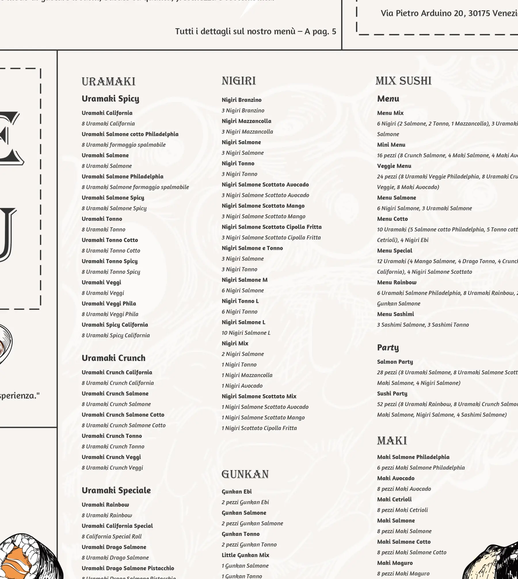
KORE DESIGN / GRAPHIC PRINCIPLEGive information a clear order,
From menu to real commercial environment.
and make the brand visible at every distance.