ORDERLinear order
Hair stations run continuously along the left, nail and pedicure services are grouped on the right, the wash area sits at the back and a clear central route remains open.
 KORE DESIGNArchitecture · Interior · Delivery
VOGHERA / COMMERCIAL / HAIR + NAIL
Within a long, narrow unit, hair, nail, wash, pedicure, display and storage functions are organised into a clear, bright commercial system suited to intensive daily use.
A small measure of blue,
enough to make the space memorable.
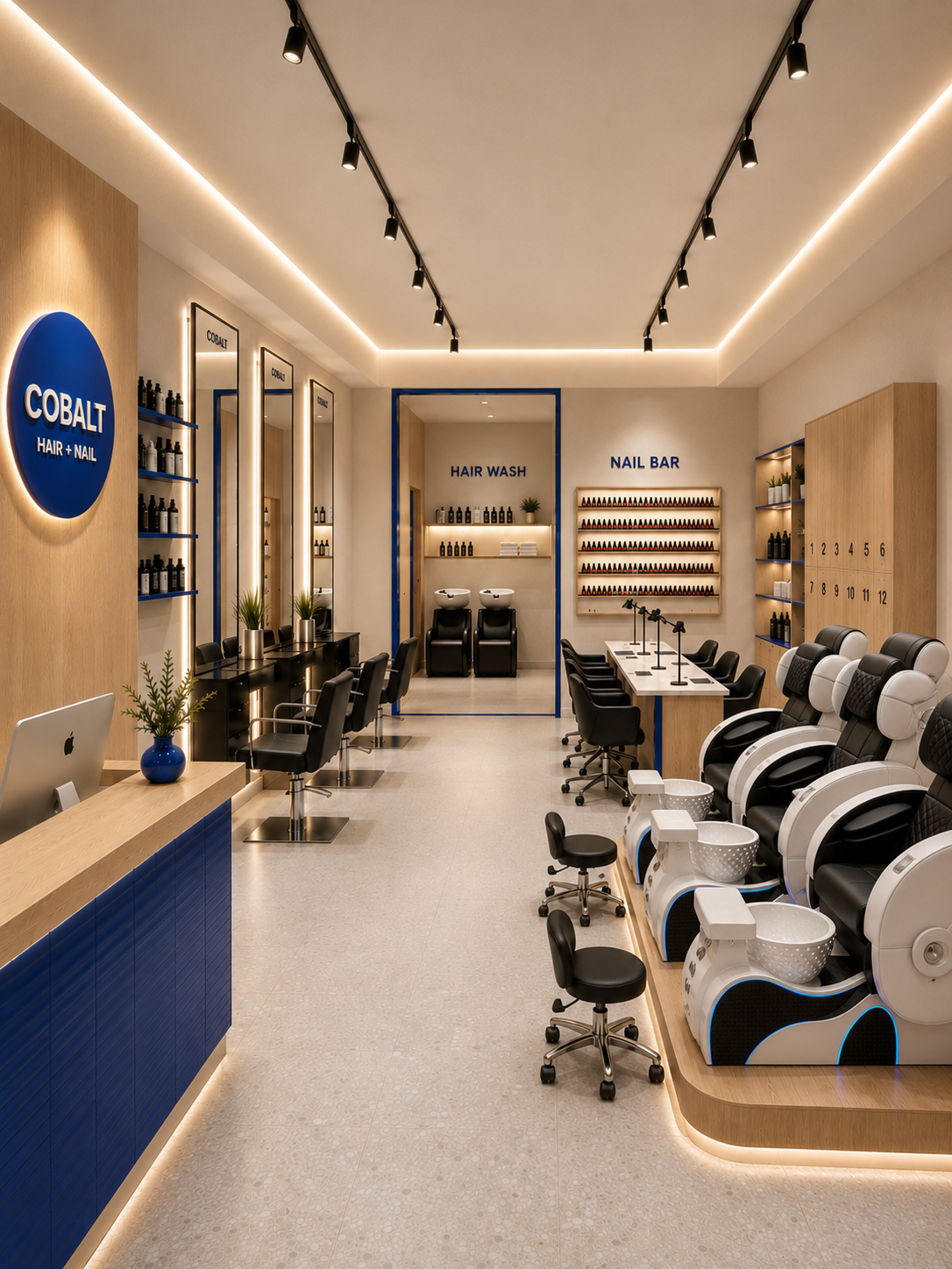
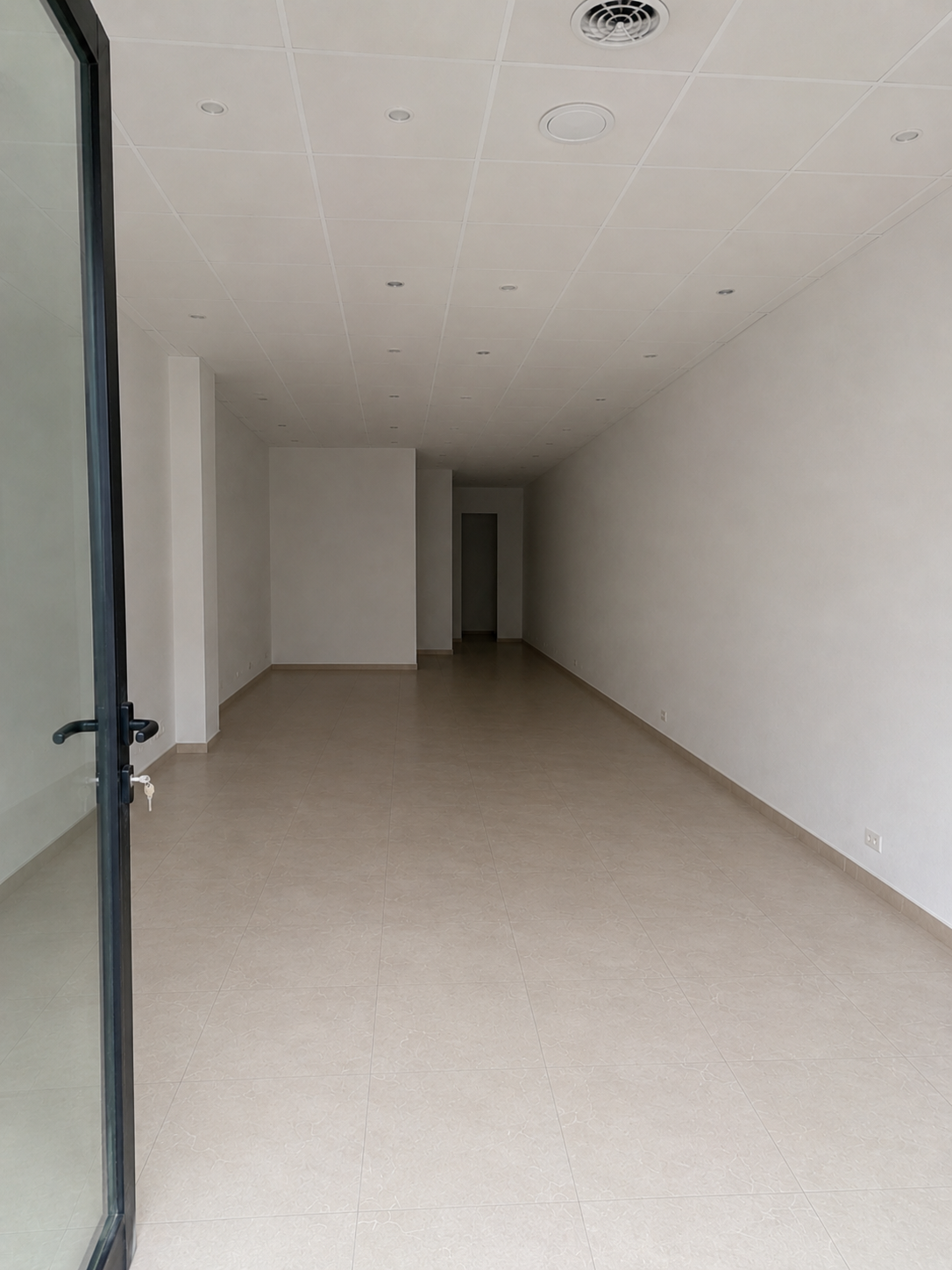
The original unit was a long rectangle with fragmented walls, columns and ceiling conditions. The new operation needed hair, nail, wash and pedicure services, reception, product display and extensive daily storage. COBALT therefore begins with the order between functions rather than an applied form.
Hair stations run continuously along the left, nail and pedicure services are grouped on the right, the wash area sits at the back and a clear central route remains open.
Continuous full-height mirrors support hair services while extending the perceived width and light of the narrow unit.
Product display, open shelves, storage and numbered lockers are integrated so frequently used items have a defined place from the design stage.
Cobalt blue appears only at key points—reception, door frames, shelves, edges and signage. A small amount of colour is enough to establish recognition.
The plan follows the existing depth. Customers understand each function on arrival, while crossings between staff, equipment trolleys and services are reduced.
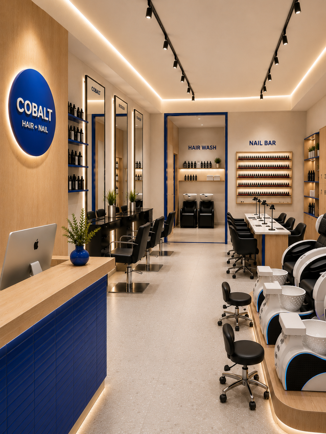
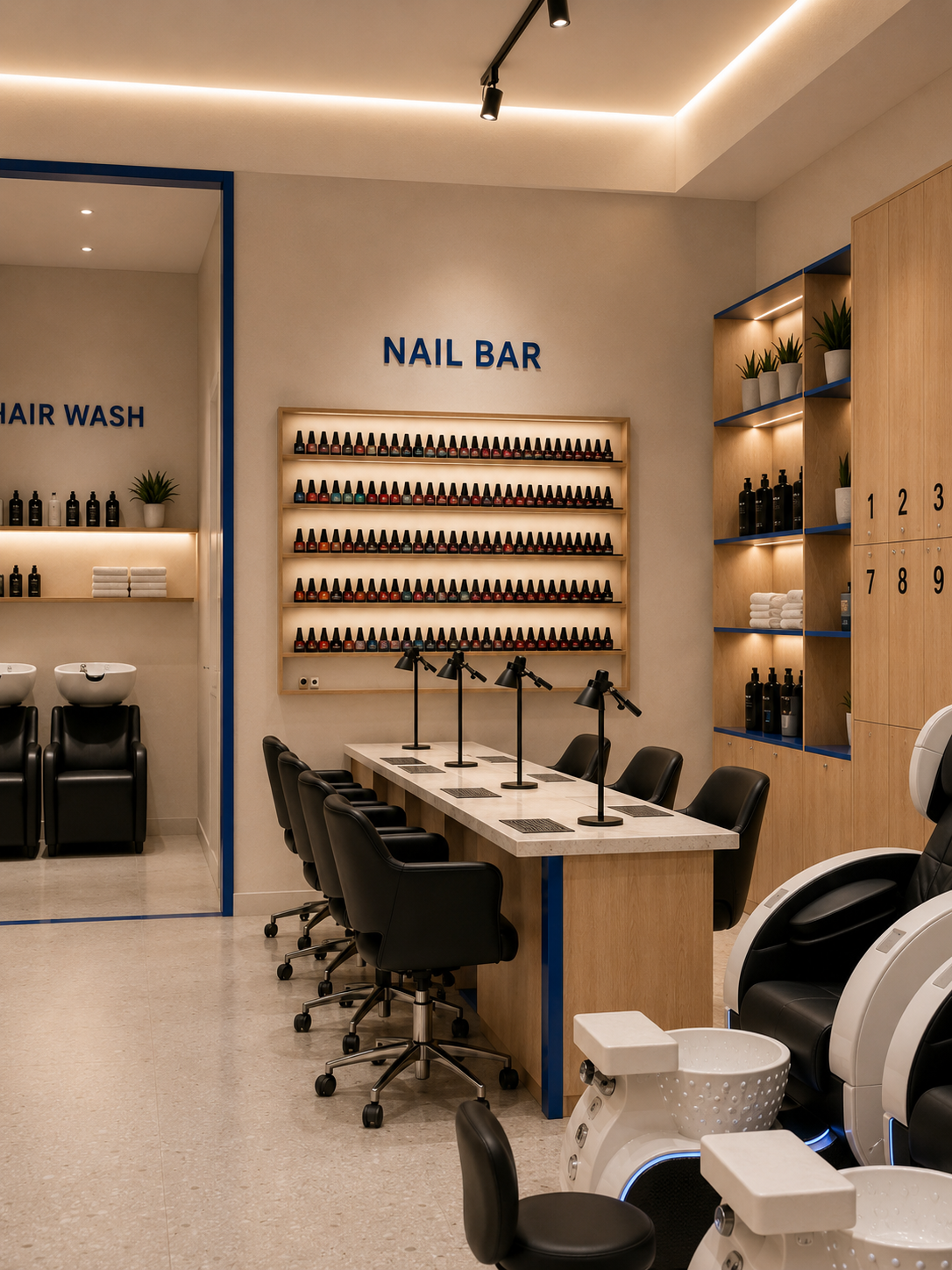
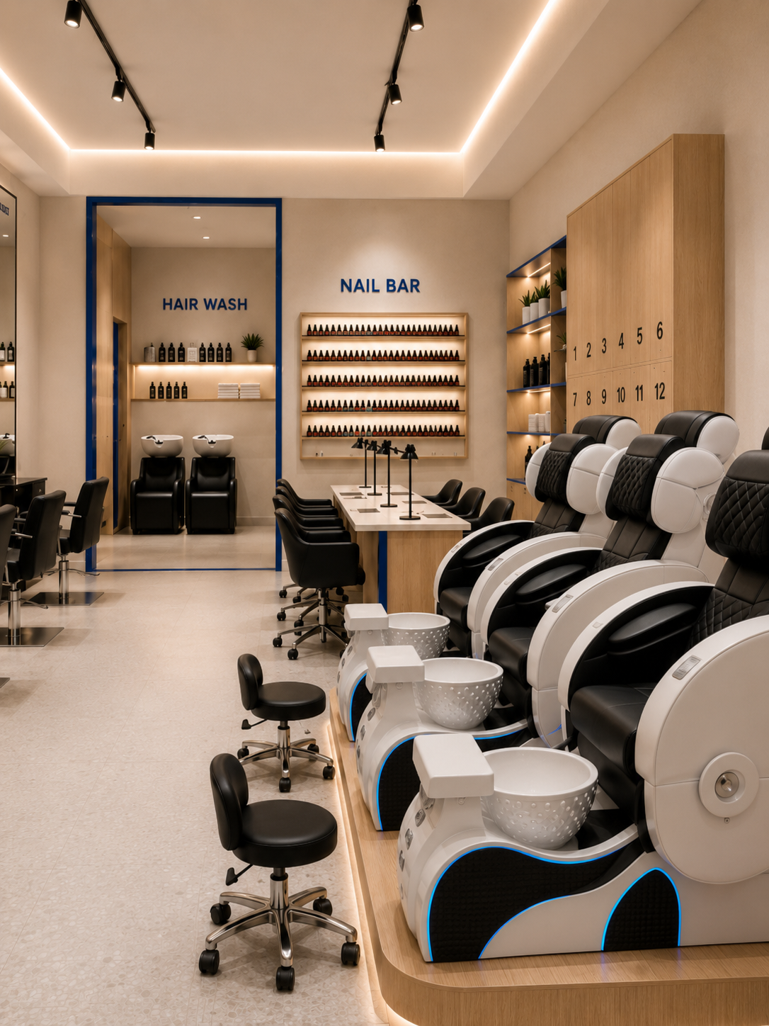
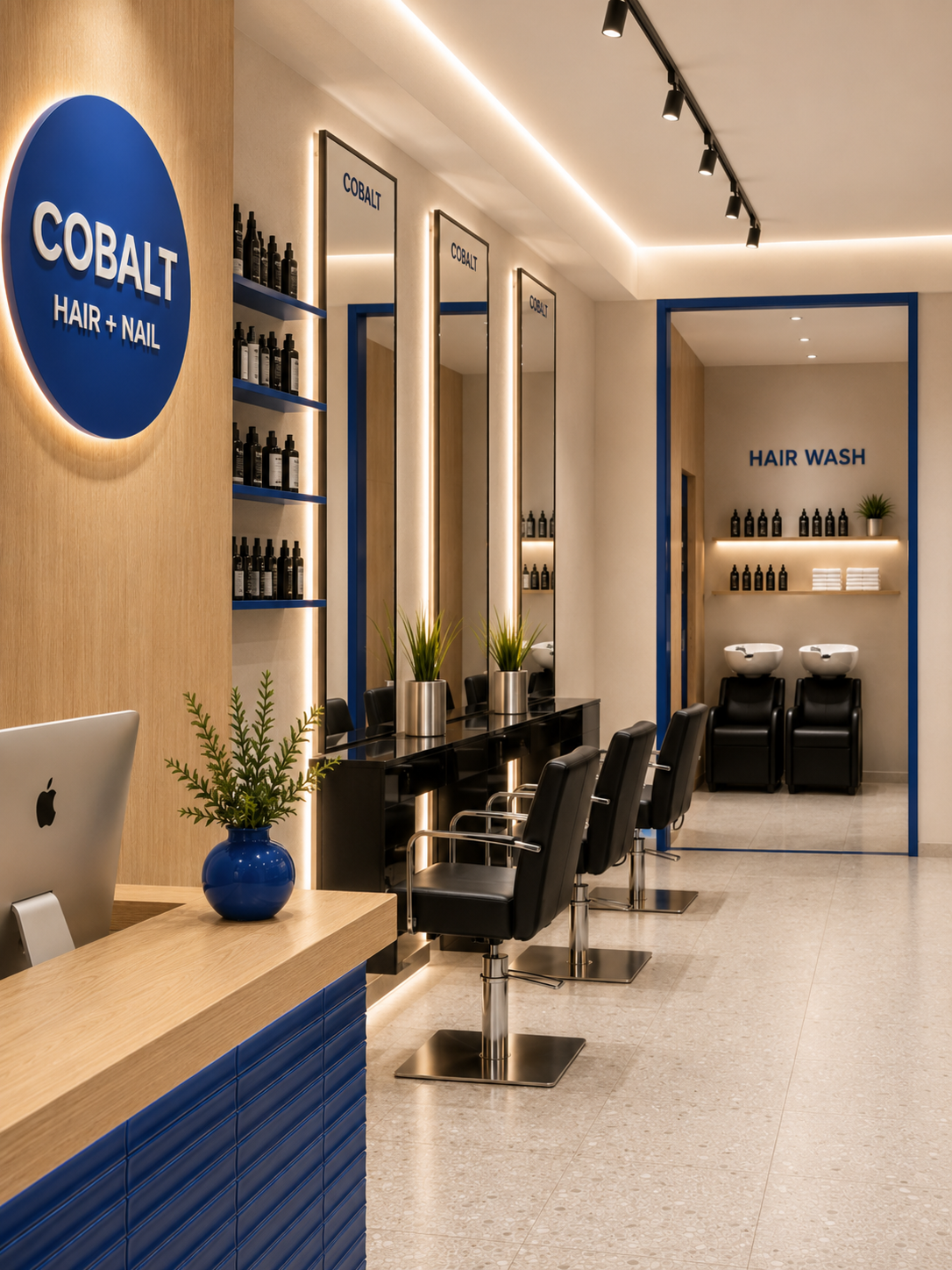
Display, open shelves, storage and numbered lockers are integrated along the right. Frequently used polish becomes a visual element, while staff stools store beneath the pedicure platform. Towels, tools, products and personal items do not need improvised positions after opening.
The original unit was deep, with daylight concentrated at the entrance. The design retains this main axis and uses light, mirrors, timber and cobalt blue to build depth and identity.
KORE DESIGN / COMMERCIAL PRINCIPLEA measure of timber, a measure of warm light,
Balancing functional density, operational efficiency and brand recognition.
and a small measure of blue.